Phones now get their own toolbar
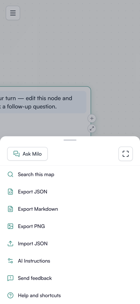
The desktop toolbars do not fit on a phone, so on a phone they are replaced.
Zoom level steppers stay in the open, because changing how much a node says is the control you reach for most on a small screen. Everything else moves into a bottom sheet behind one button: the chat panel, zoom to fit, search, export and import, AI instructions, share, feedback and help. Search opens as a full-width overlay hosting the real search field rather than a phone-sized imitation of it.
Typing in the chat panel works on iOS now. The composer rides above the keyboard instead of ending up underneath it.
Desktop is pixel-identical to what it was.
Open a map on a phone.