mindmap.io has a new look
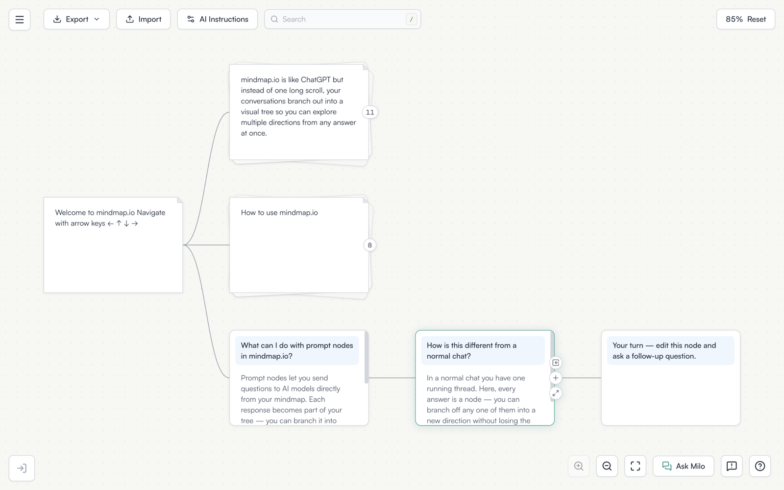
The app and the site were restyled onto one design system.
The visible part. Teal is the only accent colour now, so the blue and purple that had collected in buttons, tier pills and thread links are gone. Pages sit on warm paper rather than pure white. Borders are a consistent hairline that recolours to show state instead of thickening. Shadows follow one ladder, card below dropdown below modal. Modal overlays are a light blur rather than a dark scrim. Animations sit inside a 300 millisecond budget on one easing curve, which brought several of them down from 500, 700, 1000 and 2200 milliseconds.
The part you will not see. The rules are written down. A specification at the root of the repository defines every token and every component, it is published at mindmap.io/design.md, and a test fails if the product drifts from it. Buttons now come from two shared primitives, so a new control cannot invent its own look, and an icon-only control is required to carry a label.
There is also a proper 404 page, which the site did not have.
Open the app and have a look.